VOSN is an online shopping event, partnering with fashion, beauty and homewares retailers from around Australia. The event is hosted in the VOSN hub on Vogue.com.au, and expands through media campaigns, social and editorial content.
Why did VOSN need a redesign?
Vogue adopted a new design system (from Conde Nast International) that changed backend functionality as well as front end look and feel. The VOSN hub had to be migrated to a new platform and redesigned to fit with the new standards.
This was also an opportunity to rethink old user flows, and resolve multiple pain points for users, the Vogue team and participating retailers. The old hub was designed as a directory, missed potential in revenue and didn’t align with the expectations users had with Vogue as an authority in fashion.
My role and responsibilities in the project
1. Competitor analysis
2. Scoping and resolving pain points for users, internal Vogue teams and participating retailers
3. User flows, wireframes and prototyping
4. Integrate a new design system
5. Create new possibilities to raise sales revenue through design and engagement
6. Present solutions to stakeholders
7. Create supporting design material (assets for the website, marketing and social campaigns).
My team
Ben Langford - Product manager
Harry Cet - Developer
Scope
Duration: 3 months
Product deliverables: Home page, retailer page, search functionality, category display page, supporting design material.
Challenges and constraints
1. Restricted dev time - There were very few hours allocated for the build. This meant the design had to be simple to build and widgets reusable across the site. I worked closely with our developer, updating him about my design ideas and receiving advice.
2. Raising revenue through design - how do I structure a user journey that increases page views, retailer exposure and ultimately sales? Is this something a design can achieve?
3. Promoting brands rather than products - backend limitations meant that direct purchase through the VOSN hub was unavailable. Unlike other e-commerce sites, the focus had to become about the brands and their story, rather than a quick purchase of products.
Before
Process
01.
Competitor analysis
I wanted to study how luxury e-commerce platforms communicate with customers. What does the target audience expect from the platforms? Are there any points of similarity and differences between the various ones? How is their user journey encouraging and making purchasing easier for the user? Here’s what I discovered:
1. Visual language - all brands featured large imagery and videos, combined with big typography and ample white space.
2. Flow on HP - new products were featured first, followed by 'recommended' and in depth introduction to specific brands.
3. Story behind the brand - a very common home page feature. Showcasing a number of campaign images along with an editorial link.
4. Using authority - all the brands I reviewed used the trust they built with their customers to recommend products.
5. Detailed search functionality and filters.
Our competitors tell a story about themselves,
and the brands they feature. But ultimately - they present a reflection of who their user aspires to be.
02.
Analytics from previous years
I wanted to see how our customers used the old website. Where did we lose them? What pages/topics raised the most interest? What was the flow that directed them to make a purchase?
I learned that emphasising Vogue’s authority in fashion and beauty is the most direct way to encourage purchases. The users were mostly interested in editorial content that discussed brands/products featured in the sale. Articles like ‘what Vogue editors are buying from VOSN this year’ had high engagement numbers, and most of the clicks into retailer pages were through editorial recommendations.
Our customers trust our opinion as a global brand when it comes to their own fashion/beauty decisions.
Analytics also showed people dropping off after scrolling through the ‘catalogue’ style brand names on the home page. As I’ve seen in my competitor analysis, people prefer being told a story with only a few highlighted options to choose from.
03.
Stakeholder interviews and surveys
In order to map out what needed to be delivered for this project, I addressed the main stakeholder groups - internal teams at Vogue, and surveys from numerous retailers about their experience in previous years.
I met with the marketing, sales and editorial teams at Vogue, and asked for their opinions on the current hub, what they’re struggling with and what would be their ideal vision for the hub and event in general. As for the participating retailers, I read through detailed surveys that were conducted after each VOSN event. From that, I extracted the main issues to address to make the process smoother for them
I learned that other than frustration with the current design and usability of the hub, there was a real issue with communication between Vogue and the retailers. For example, Vogue would ask retailers for their logos and product images. They never specified the correct specs, resulting in blurry product images and cut-off brand logos. This then continued to an endless back and forth between the two, creating stress and resulting in average looking retailer pages.
I also learned that retailers were frustrated with being stacked alphabetically in an endless stream of brands on the home page, even though they paid a big amount of money to be featured. They felt their brand wasn’t highlighted enough.
04.
Pain points
There are three parties to consider in this project - users, internal Vogue teams and participating retailers. These are the high level pain points I learned about-
Users
1. There was no information hierarchy.
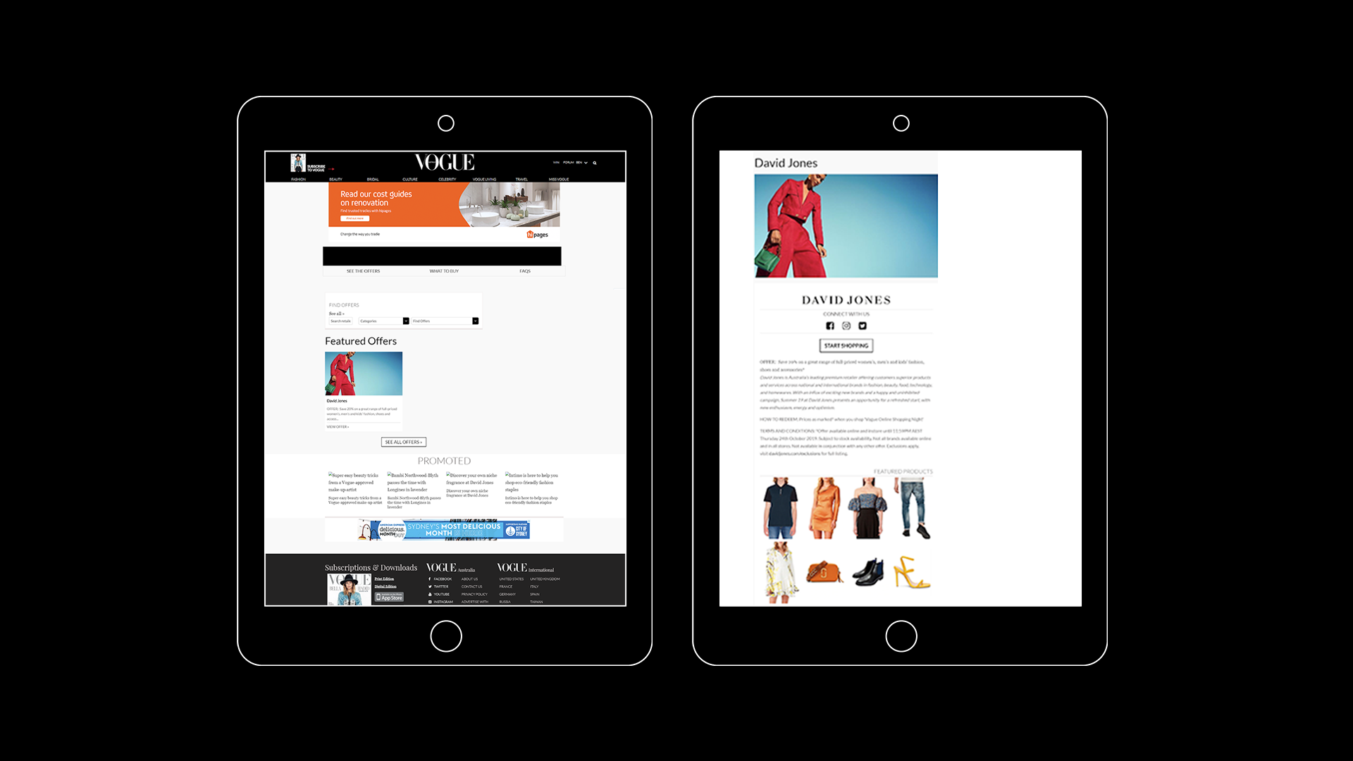
The home page in the old design was just a feed of the participating retailers who were organised in an a-z manner, with a Pinterest-like grid. All entries appeared the same, not allowing users to easily scan the page. Extracting information and finding a specific retailer was difficult, and required a long scroll through the feed.
2. There was no story telling.
People who consume brands like Vogue and are interested in fashion, beauty and interiors are highly visual people. They are used to scrolling through e-commerce sites that offer them a lifestyle and a story about the products they sell, communicating luxury. Users expect a brand like Vogue to deliver a similar experience. The old website failed to tell that story, and was designed as a directory, eliminating the experience.
3. Finding a retailer relied on clumsy search functionality.
As a user, I want to be able to find the brand I’m looking for quickly and efficiently. I also want to be introduced to new brands and categories I wouldn’t necessarily know about on my own. The previous way of searching on the site didn’t allow that - with hidden drop down windows for categories, and a free search that didn’t allow users to see what they’re typing.
4. Purchasing products was challenging.
As a user, I would expect a product image to lead me directly to the product page on a retailer’s site. That wasn’t the case with the old design. A product gallery existed, but the products had no price, descriptions or links to purchase. As a user, I had to go to the retailer’s website, then look for the piece I was interested in myself.
Internal Vogue teams
1. The design was outdated.
The old hub didn’t match the new design system Vogue adopted. If you reach the hub from Vogue’s homepage it looks like two separate brands.
2. Miscommunication with participating retailers.
There wasn't a clear way for Vogue to communicate an editorial and marketing schedule, as well as sending retailers specifications for their page build (for example, how should they send us their logos, copy, gallery images etc...), resulting in pixelated images and empty states that didn't reflect well on Vogue nor the retailers.
3. Raising revenue.
Along with the design refresh there was a request to up sales and engagement with the participating brands.
4. Using Vogue's authority in fashion and beauty.
Analytics from previous years showed people were most interested in editorial content from Vogue writers, discussing what they're planning on buying during VOSN. The click rate to purchases was high as well. This proves that people ‘listen’ to the brand, and want to be guided. This was a sales tool the previous design didn't engage with.
Retailers
1. Brand visibility.
The previous design didn’t allow visual hierarchy for brands displayed on the site. Some were seen immediately (in the a-z order), while others were hidden.
2. Product gallery is unclickable.
Customers have to work too hard to find a product they saw on VOSN, resulting in many missed sales opportunities.
05.
Mapping out features
With learnings from analytics, interviews and competitor analysis, I mapped out features that will need to be designed and added.
1. Home page
2. Search functionality
3. Sub-nav
4. Category page
5. Retailer page
6. Sales/marketing deck
7. Supporting design material - visual assets for the website, social and marketing.
06.
Solutions
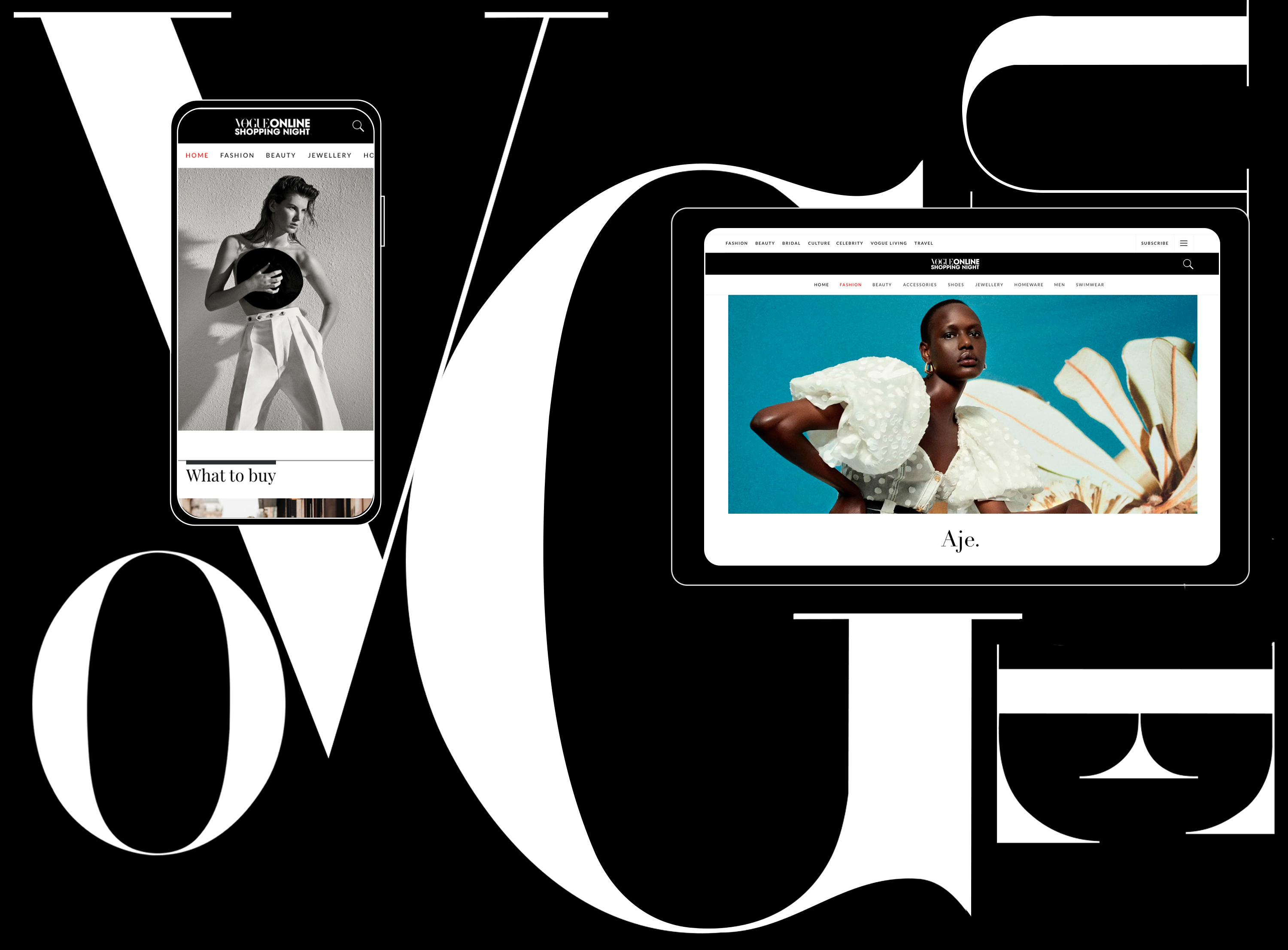
Homepage
I wanted people who visit the site to be excited about the sale, and be exposed to new retailers. To answer that, I custom made a hero video for the homepage, showcasing products in a fun way, as a quick introduction to the sale.
Research showed that editorial content is a big trigger for engagement and sales, so following the hero video is an editorial widget, containing four stories that discuss what our editors are buying, and other stories highlighting some of the brands. This answered Vogue’s need to expose editorial content as a sales driver. Exposing the content on the hub helped engage users and raise revenue directly from the stories.
Major pain points were finding new ways to raise revenue and a way to use Vogue’s authority on what to buy. My research showed that people are interested in being led by Vogue and the editors, so I designed a widget to answer that need, ‘Editor’s picks’. The widget features 4-5 brands that are ‘Vogue editor approved’. It contains large impressive imagery, the retailers’ logos and percentage of discount.
Not only did this widget create new selling tiers for the sales team, it also proved to be the section users engaged with the most. This was also a solution to the homepage telling a story, giving users highlighted options rather than confusing them with a directory to scroll through.
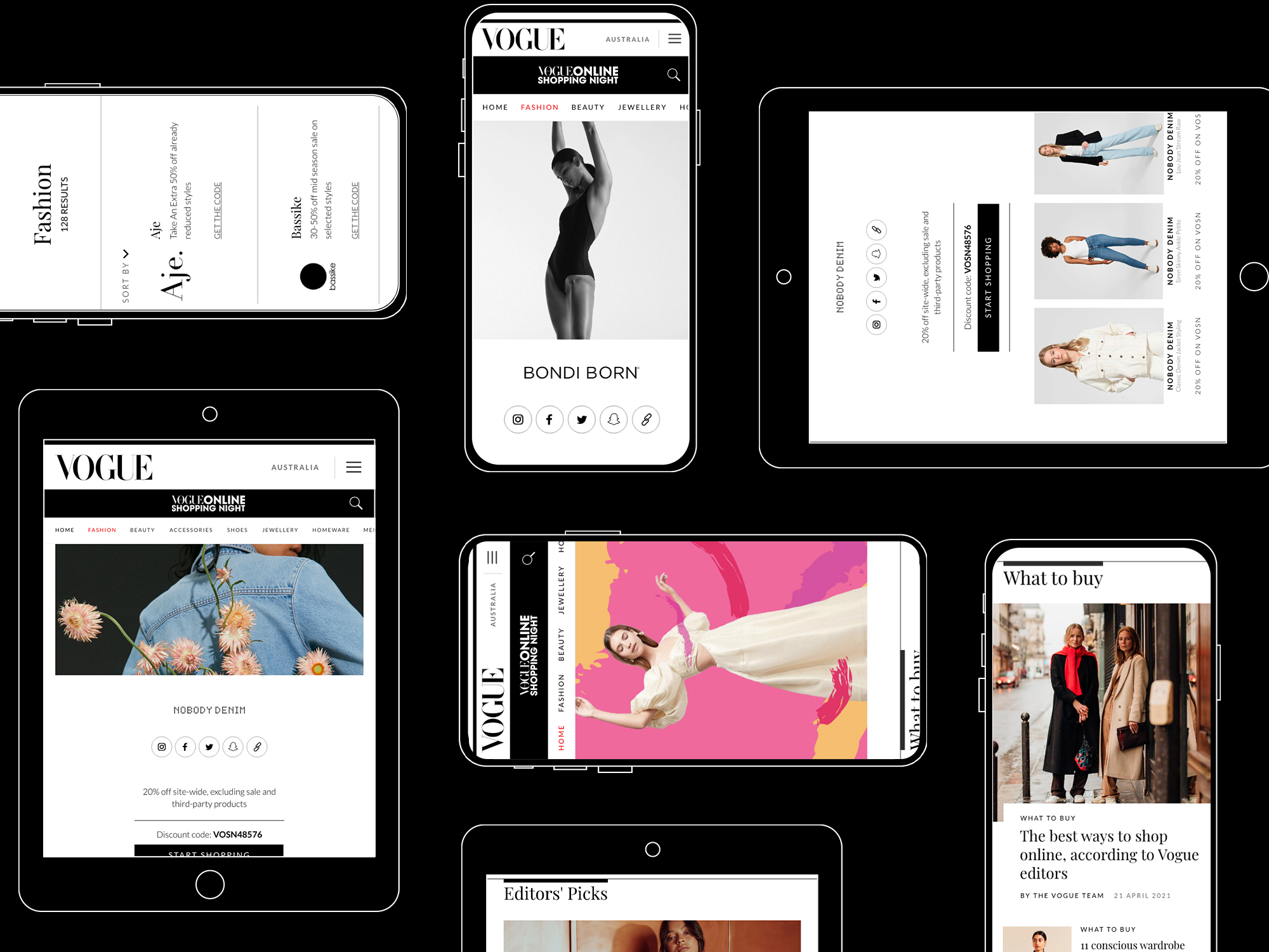
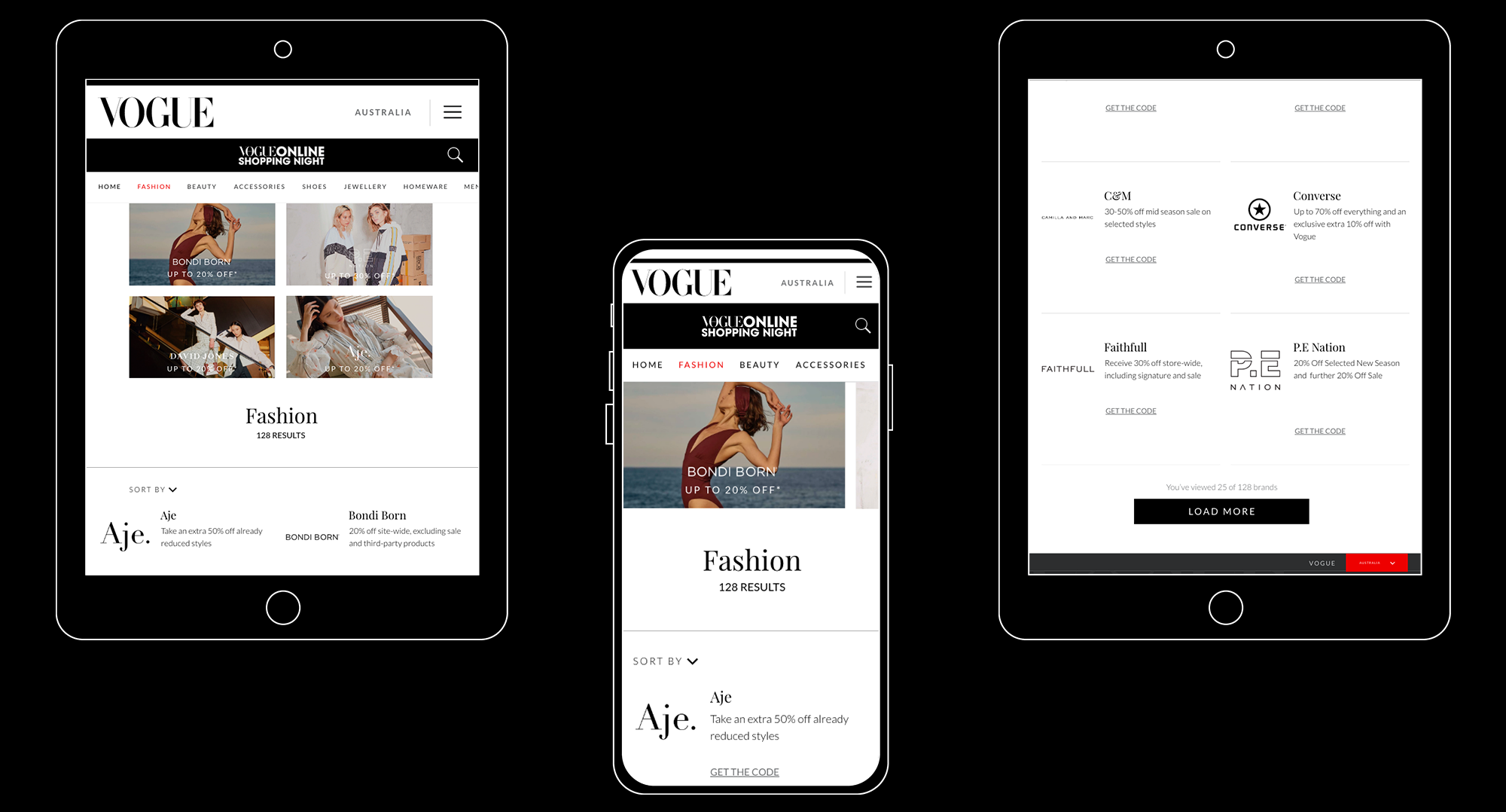
This widget also appears in a smaller form at the bottom of every retailer as a tool of further engagement. It also sits as a swipe through widget at the top of a category page and search results, giving the brands high visibility throughout the site. This helped resolve the pain point of raising revenue and engagement.
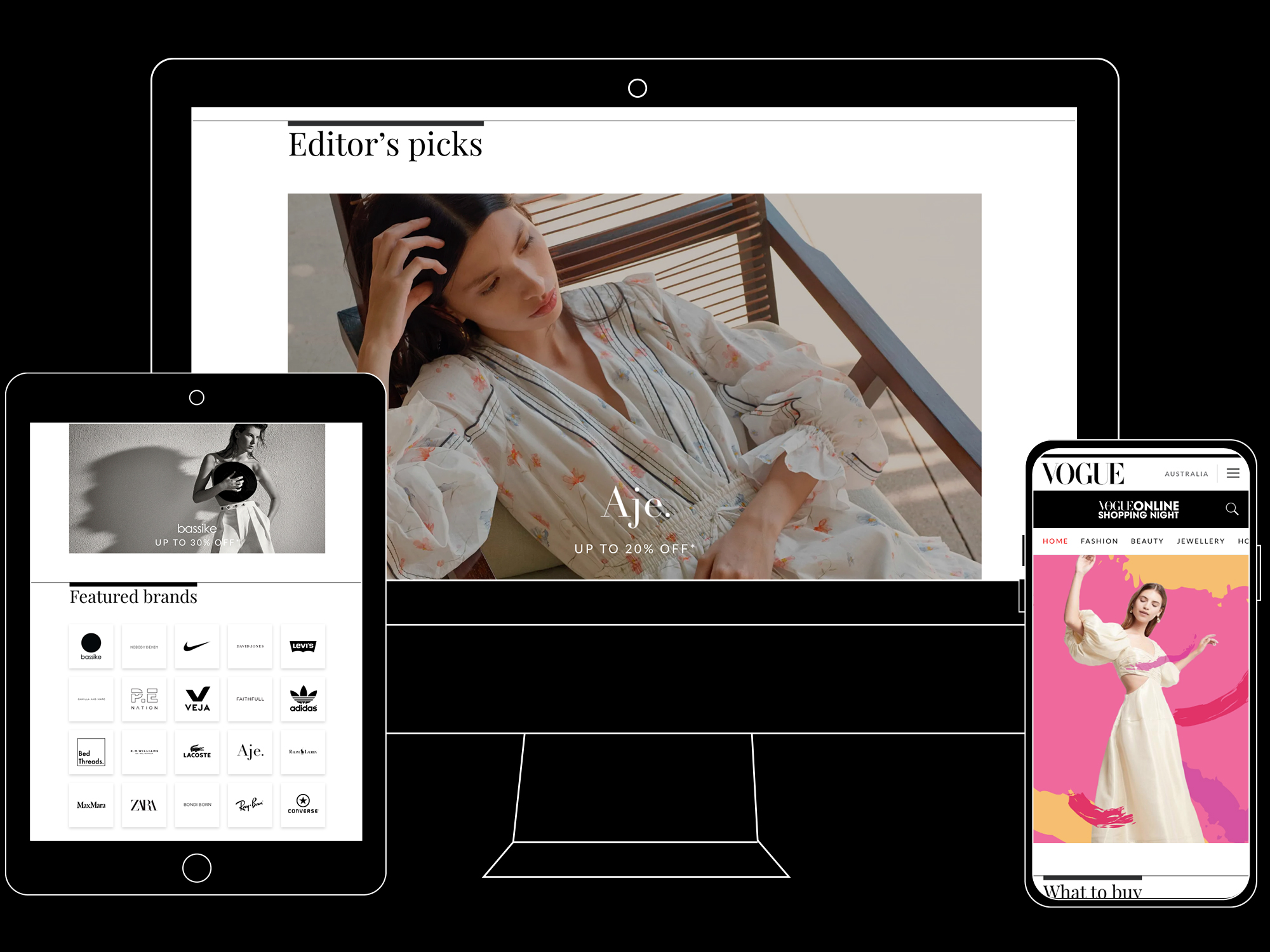
‘Featured brands’ is a widget I designed to sit at the bottom of the HP, and at the bottom of every retailer page. Its role is to expose the user to a reduced list of brands, but in the form of logos. This allows users to engage with more options, but in a ‘digestible’ way. This was the second highest engagement driver on the site. This widget also allowed for more sales packages to be created, therefore increasing revenue.
The widgets designed for the homepage helped create information hierarchy and gave Vogue an opportunity to tell a story about the sale and the brands involved.
Sub-nav
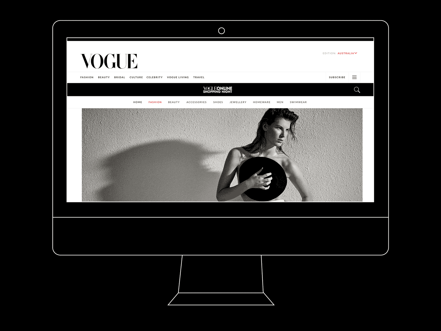
The sale contains many sub-categories. From fashion to beauty, homeware and accessories. Those categories were previously hidden in a drop down window, as a part of a search filter. Meaning, you couldn’t reach a page just for fashion, or just for beauty. I felt like these are key components of the sale, and should be exposed for easy navigation, as well as showcasing the variety in the sale. I created a swiping sub-nav that contains all the main categories, and is constant on all pages of the hub. This resolved the pain point of relying on a multi drop down windows search functionality to find something you’re interested in.
Category page
Every category presented in the sub-nav has its own page, featuring the retailers that fit the category. The page has sorting options, and is displayed in a way that’s easy to scroll through and consume. This answers the need for retailers to be found easily, and have representation in the form of a logo and details of the sale they’re offering.
Search functionality
The old hub had a complicated drop down search that was especially difficult to use on mobile. It was exposed on all pages and had multiple windows and fields. While considering limited dev time, I wanted to design an easier and cleaner way of searching for brands. I removed the original search fields and added a simple search icon to the right of the nav, which opens a separate window and allows for a clean experience. It has predictive search and filtering options. This resolves the pain point of the difficulty of finding the retailer you’re interested in.
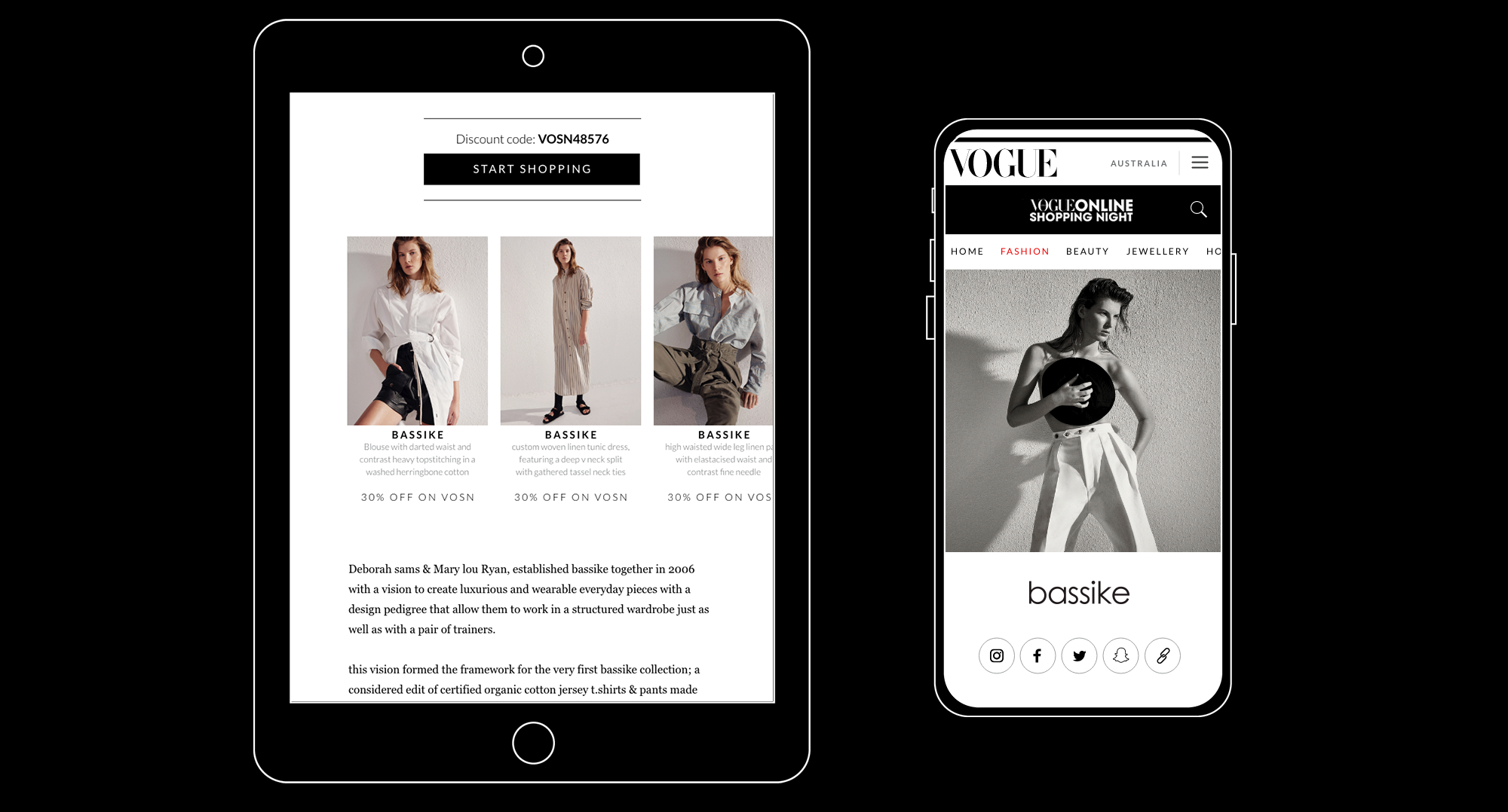
Retailer page
The retailers’ main pain points were brand visibility and a product gallery that was unclickable. Other than that, I wanted to give them a page that showcases their style and allows customers to further engage with them.
At the top of the page, I decided to have a large image of the brand (to their choosing, could be a current campaign or a lookbook) to really give the consumer an understanding of what this brand is all about. It’s followed by a large logo, and links for their social media, and website.
Following that, is a section displaying the discount code, with a large CTA for the retailer’s website. The previous design had the code hidden in large amounts of copy, forcing the user to skim through the copy to find the code.
Next is a short bio provided by the retailer, discussing how the brand was formed, who are the designers, what are their practices, etc… This answers the need of a story being told, evoking emotion rather than a dry promotion opportunity.
The product gallery was also redesigned. I changed the image crops to fit an industry standard for lookbook to make it easier for the retailers to provide assets. I also limited the amount of products to 4-6 (the previous design had 12-14) so users aren’t overwhelmed with options. To every product I added a title, short description and price. All products are hyperlinked to the proper page on the retailers website for an easy purchase, resolving one of the retailers’ pain points.
At the bottom of every retailer page you can find two widgets - a minimised version of ‘editor’s picks’, and the featured brands (all logos). This was done in order to encourage engagement even after a user looked at the products they liked, giving them a chance to explore more options. Post-sale analytics proved the goal was achieved.
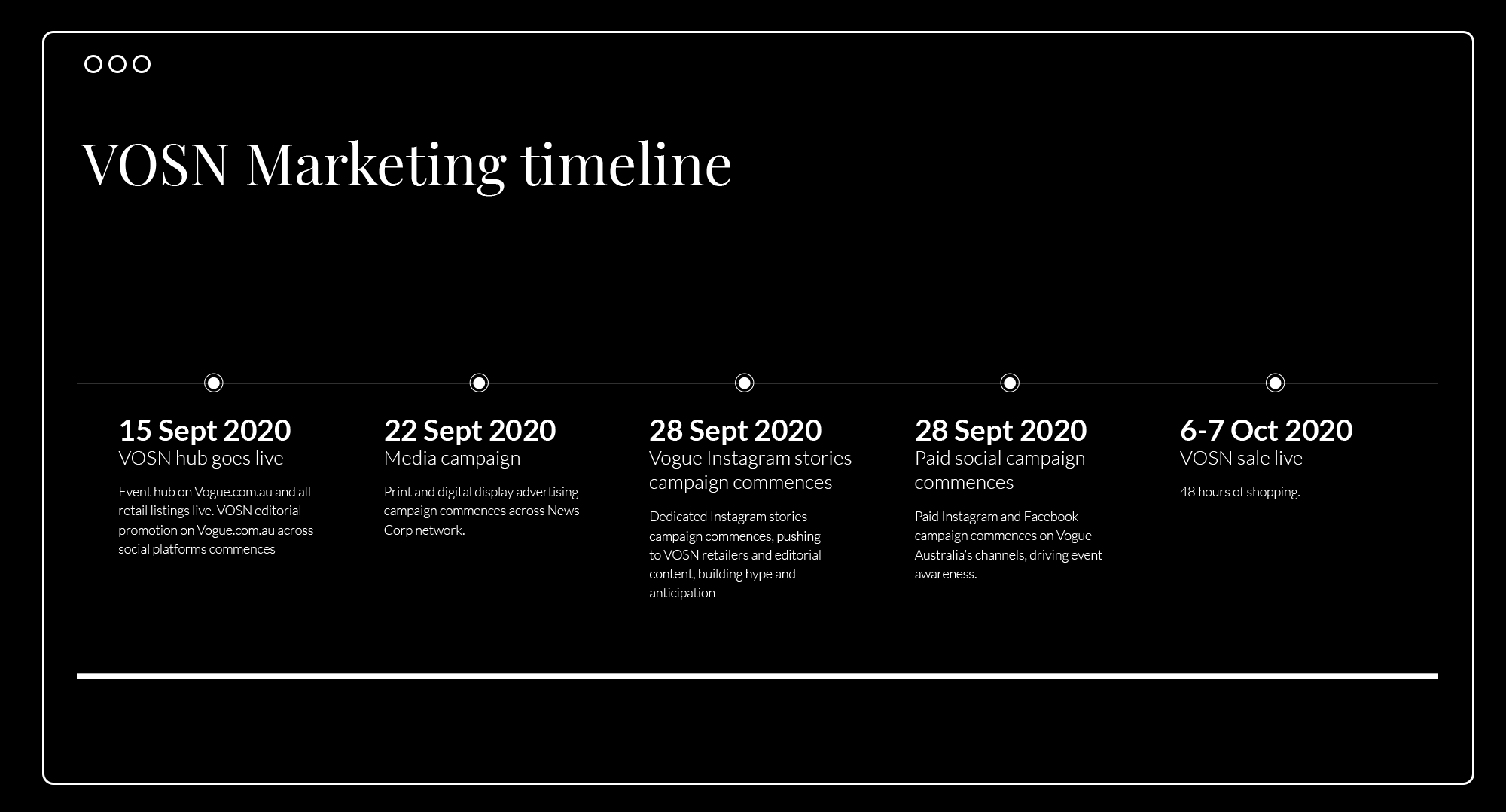
Sales/marketing deck
A major pain point for both retailers and Vogue was the communication between them around assets and timelines. I decided to design a deck explaining sales options, what needs to be provided and how, along with a marketing/editorial timeline. The deck was distributed to all participating retailers. This solution was a huge success, and helped to make the process smoother annulling the need of a long back and forth and extra days of uploading the wrong assets.
07.
Wireframes and iterations
Wireframing along with analytics learnings from previous years allowed me to map out all the potential user flows. I looked at different order of widgets on the homepage, focusing on editorial content being at the top.
I also had many versions and iterations for ‘editor’s picks’. Initially my thoughts were around showcasing specific products, making them quick and easy to purchase. But due to lack of resources and back end functionality I reverted back to finding a way of highlighting a brand, rather than product.
Analytics revealed that many users were directed to the hub through social media, therefore the landing page wasn’t necessarily the homepage. I had to make sure that no matter the entry point, the user was always clear on where they are and able to navigate through the site easily. This influenced my decision to have a sub-nav with sale categories exposed, rather than a hidden menu.
Another point of focus was ensuring a smooth transition between devices (desktop to mobile), especially around image crops. Since one of the main goals was highlighting brands, I didn’t want image crops to look big and impressive on desktop and reduce dramatically for mobile. This led to a few flows consisting of different crops and examining their appearance on different screens.
I also experimented with an option to ‘like’ items and save them on a curated list in a pre-sale state. This would make the purchasing process much easier during the night, and allow the user to calmly look at products and make decisions before the sale is live. This type of feature needs integration with a system called Gigya, which requires people to register to the site. This idea was received very well by the team at Vogue, but as the integration process is large scale work, this idea had to be saved for another time.
The next step was presenting design options to the heads of sales, marketing and editorial. As I worked very closely with all the teams during the various stages of ideation and design, the feedback was minimal. Most of the iterations were mainly around sponsor integration (American Express) on all stages of interaction with the hub.
08.
Results
1. Raising revenue through design.
Highlighting a small number of brands on the HP and result pages (editor’s picks/featured brands widget) increased engagement and revenue. It also created options for the sales team - ‘tiers’ were created based on the design, with increased rates for highlighted brands.
2. Increased traffic and brand awareness for retailers.
Majority of the traffic came from the 'start shopping' button, followed by the clickable product gallery.
3. Editorial content on the hub increased page views and purchases.
Articles like 'What the Vogue editors are buying on VOSN' still proved to be popular and led to direct purchases.
4. Smooth communication between internal teams and participating retailers.
Creating a detailed deck made expectations clear for both parties. The teams decided to adopt it as a constant feature for VOSN events.
5. Engaging stakeholders.
I learned the importance of engaging with stakeholders during the design process. This led to fewer iterations and everyone knew what to expect. It also created trust, and made everyone feel like a part of the process.
6. Producer controlled widgets.
We ended up with a set of widgets that can be repurposed for other events. They will all be producer controlled, saving time and resources for the company.